
Have you ever wondered why some paintings have such harmonious and striking colors, while your own paintings might lack the same vibrancy? Many artists initially assume that the brand of oil paint or the thickness of application is the key to achieving those rich colors. While these factors do play a role, the true secret lies in the contrast between the subject and the background.
The Background as the Foundation
Next time you observe a painting, start by analyzing the background. The background colors set the stage, creating the contrast that makes the subject’s colors shine. Without the right background, the subject’s colors won’t appear as vivid or soft as intended.
An artist must study color contrast to control the mood and intensity of a painting—whether creating bold, vibrant effects or gentle, subtle tones.
Understanding Color Contrast
1. Complementary Color Contrast
One of the most powerful types of contrast is complementary contrast—where two opposite colors on the color wheel are placed together. This creates high contrast, making the smaller or less dominant color appear even more intense.
Examples of complementary pairs:
- Yellow & Violet
- Orange & Blue
- Red & Green
This doesn’t mean you must use these colors in their pure form. For example:
- An ocher vase will contrast well with blue-violet.
- A pink subject will stand out against a blue-green background.
Using a large color wheel can help you find more complementary color combinations for your paintings.
✅ Rule of Thumb: For the best effect, one color should take up more space than the other. If both are equally distributed, they will compete for attention rather than create harmony.
2. Light-Dark Contrast
Colors change drastically depending on the surrounding colors.
- A light color will appear brighter if placed against a dark background.
- A dark color will seem darker when surrounded by light tones.
Let’s take a cube example:
🟧 Ocher Square Example: Even though both squares are the exact same color, they appear different based on their surroundings. This shows how important background selection is when designing a composition.

Practical Application in Painting
When planning your painting, think about shape, size, color, and contrast between the subject and background.
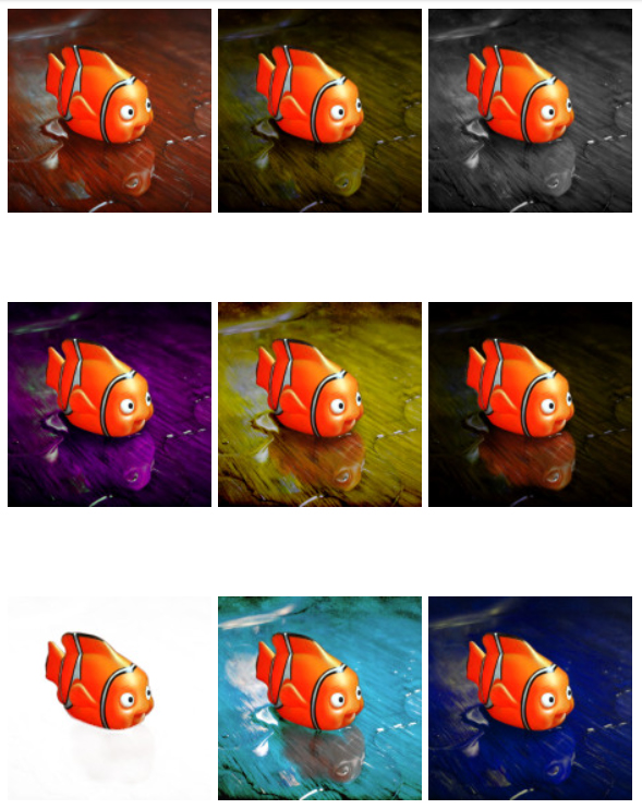
In my own painting of a Nemo toy, I experimented with different backgrounds:
- First, I placed it on a gray concrete floor—but the contrast was too weak.
- Then, I tried a blue cloth—this improved color contrast but didn’t enhance texture.
- Finally, I chose a wooden table with visible strands and grain. The rough wood texture contrasted with Nemo’s smooth surface, enhancing not just color contrast but also tactile contrast (soft vs. rough).
✅ Lesson: The right background not only improves color contrast but also enhances the visual and textural impact of a painting.
Final Thoughts
Understanding color contrast and background choices will take your oil paintings to the next level. By carefully selecting complementary colors, light-dark relationships, and textural contrasts, you can control the mood, depth, and harmony of your artwork.
Next time you plan a composition, start with the background—because the foundation of great color begins before the first brushstroke on your subject. 🎨
- The Role of Background Color in Oil Painting
- The Relationship Between Distance and Contrast in Painting: A Comprehensive Guide
- Observation in Painting: How to Train Your Eye Like the Masters
- The Day My Teacher Took Away My Black and White Paints – and How I Learned to Avoid Muddy Colors.
- Why is it so hard to capture shape and volume?