The Magic of the Zorn Palette: Painting Portraits with Timeless Elegance
The Zorn Palette, named after the Swedish master Anders Zorn, is a testament to the power of simplicity in art. Comprising just four colors—yellow ochre, ivory black, cadmium red (or vermilion), and titanium white—this limited palette has been used for over a century to create stunning, lifelike portraits. Its ability to produce a wide range of natural skin tones and harmonious compositions makes it a favorite among artists, from beginners to seasoned professionals. In this blog post, we’ll explore the allure of the Zorn Palette, its historical significance, and how you can harness its magic to create captivating portraits.
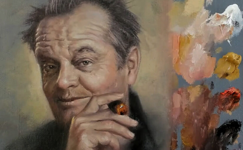
Here is a livestream showing how I use the Zorn Palette.
What Makes the Zorn Palette Special?
The Zorn Palette is more than just a set of colors; it’s a philosophy of restraint and focus. Here’s why it stands out:
- Simplicity: With only four colors, the palette eliminates the overwhelm of choice, allowing artists to focus on value, composition, and brushwork.
- Versatility: Despite its limited range, the Zorn Palette can produce an astonishing variety of tones, from warm highlights to cool shadows.
- Timelessness: The muted, earthy colors evoke a classic, almost universal quality that transcends trends and styles.
- Efficiency: Mixing colors is straightforward, making it ideal for plein air painting or quick studies.
The Colors of the Zorn Palette
Let’s break down the four colors and their roles:
- Yellow Ochre: This warm, earthy yellow forms the foundation of skin tones and mid-tones. It’s perfect for capturing the natural warmth of the human face.
- Ivory Black: Contrary to its name, ivory black is a cool, bluish-black that can be mixed with white to create a range of grays. It’s essential for shadows and cooler tones.
- Cadmium Red (or Vermilion): This vibrant red adds warmth and richness, especially in the cheeks, lips, and other flushed areas of the skin.
- Titanium White: Used for highlights and to lighten colors, titanium white brings luminosity and contrast to the painting.
The Historical Significance of the Zorn Palette
Anders Zorn (1860–1920) was a Swedish painter known for his masterful portraits and depictions of rural life. While there’s debate over whether Zorn exclusively used this limited palette, his works undeniably showcase its principles. Zorn’s ability to create lifelike skin tones and atmospheric depth with such a restricted range of colors has inspired generations of artists.
The Zorn Palette’s influence extends beyond Zorn himself. It aligns with the traditions of the Old Masters, who often worked with limited palettes to achieve harmony and cohesion in their paintings. Today, it remains a popular choice for artists seeking to simplify their process while maintaining a high level of realism.
Why the Zorn Palette Works for Portraits
Portraits are all about capturing the essence of a person, and the Zorn Palette excels at this. Here’s why:
- Natural Skin Tones: The combination of yellow ochre, cadmium red, and ivory black creates a range of warm and cool tones that mimic the subtleties of human skin.
- Harmonious Compositions: The limited palette ensures that all colors in the painting relate to one another, creating a cohesive and balanced composition.
- Focus on Value: By reducing the complexity of color, the Zorn Palette encourages artists to focus on value (light and dark), which is crucial for achieving realism.
- Emotional Depth: The muted, earthy tones evoke a sense of timelessness and emotional depth, making the portrait feel intimate and authentic.
Tips for Painting with the Zorn Palette
If you’re new to the Zorn Palette, here are some tips to help you get started:
- Start with a Sketch: Begin with a light pencil or paint sketch to establish the proportions and placement of facial features.
- Block in Shadows First: Use a mixture of ivory black and cadmium red to block in the darkest areas of the portrait. This will help you establish the structure of the face.
- Build Up Mid-Tones: Use yellow ochre and cadmium red to create warm mid-tones for the skin. Adjust the ratio of colors to match the specific tones of your subject.
- Add Highlights Sparingly: Use titanium white to create highlights, but be careful not to overdo it. Subtle highlights can bring the portrait to life.
- Experiment with Brushwork: Vary your brushstrokes to create texture and interest, especially in areas like hair and clothing.
- Embrace Imperfection: The Zorn Palette’s simplicity encourages a loose, painterly style. Don’t be afraid to let your brushwork show.
Famous Artists Who Used the Zorn Palette
While Anders Zorn is the most famous proponent of this palette, other artists have also embraced its simplicity and effectiveness. (not on all of theirs works) For example:
- John Singer Sargent: Known for his masterful portraits, Sargent often used a limited palette to achieve harmony and realism.
- Joaquín Sorolla: The Spanish painter’s luminous works demonstrate the power of restrained color choices.
- Contemporary Artists: Many modern artists continue to use the Zorn Palette for its timeless appeal and practical benefits.
Conclusion: The Timeless Appeal of the Zorn Palette
The Zorn Palette is more than just a set of colors; it’s a gateway to understanding the fundamentals of painting. By limiting your palette, you can focus on what truly matters—value, composition, and emotion. Whether you’re a beginner looking to simplify your process or an experienced artist seeking a new challenge, the Zorn Palette offers a timeless approach to portraiture.
So, grab your paints, embrace the simplicity, and see where the Zorn Palette takes you. Who knows? You might just discover a new favorite way to paint.
Have you tried painting with the Zorn Palette? Share your experiences and tips in the comments below! And if you’re new to this technique, we’d love to hear about your first attempt. Happy painting! 🎨✨