I remember when I was an art student—young and full of enthusiasm—thinking that painting was simply about applying oil paint to the canvas. That was it. I had learned to paint, but not to plan. It took me much longer to understand the importance of observation—not just a quick glance, but truly seeing and carefully planning how to start a painting.
After years of painting, here’s the observation process I’ve developed:
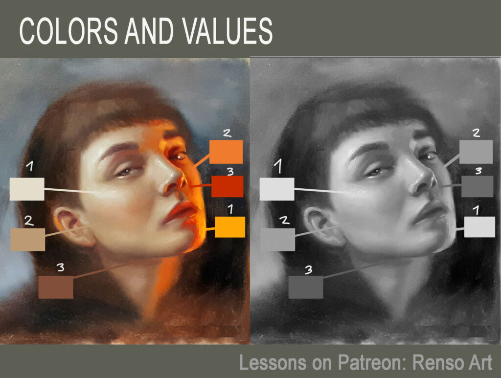
1. Analyzing contrast and values
First, I focus on contrast—where the darkest areas are most intense and where the lightest ones appear. I also assess the proportion of space occupied by each of these zones. This helps me decide whether I’ll need more dark or light colors on my palette. If the darks are very deep, I remind myself to avoid overusing white, which could lead to milky tones. If the painting has mostly light colors, I take care not to muddy them.
Pro Tip from the Masters:
- Degas kept a “value finder”—a card with small holes to isolate tones
- Sorolla worked on toned canvases to establish midtone harmony immediately
- Sargent would squint intensely to simplify values before painting
2. Selecting colors
Next, I identify the strength and purity of the colors, as well as the presence of grays. This helps me choose which colors to place on my palette. I typically work with a range of 10 colors, I have more than 30 colors including three shades of yellow, five reds, four blues, four greens, three oranges, and four violets, among others. Since I can’t place them all on my palette, I carefully select the ones that best match the subject in front of me.
Historical Insight:
Vermeer’s limited palette (just 7 pigments!) created his signature harmony. His use of natural ultramarine (more expensive than gold at the time) shows how strategic color investment pays off.
3. Evaluating temperature
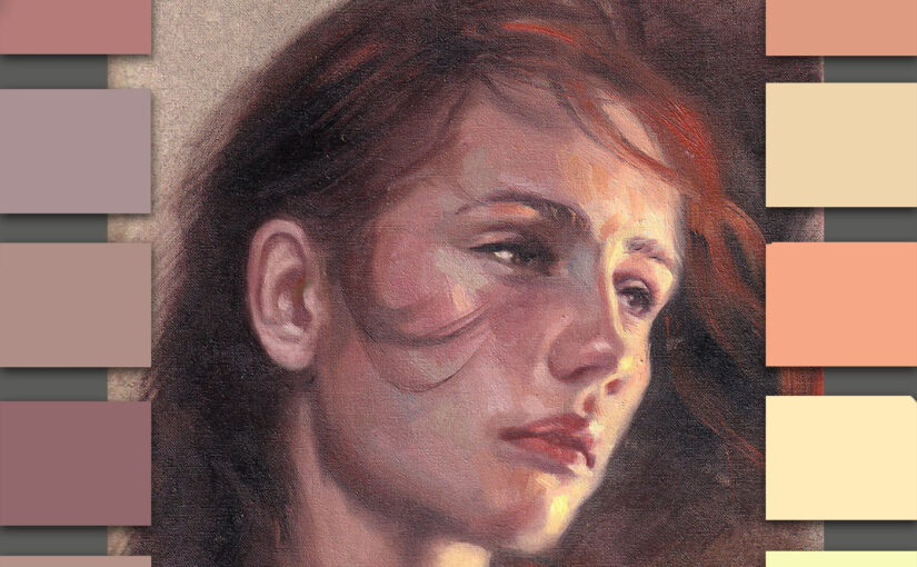
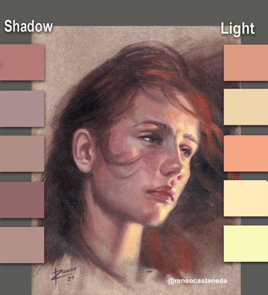
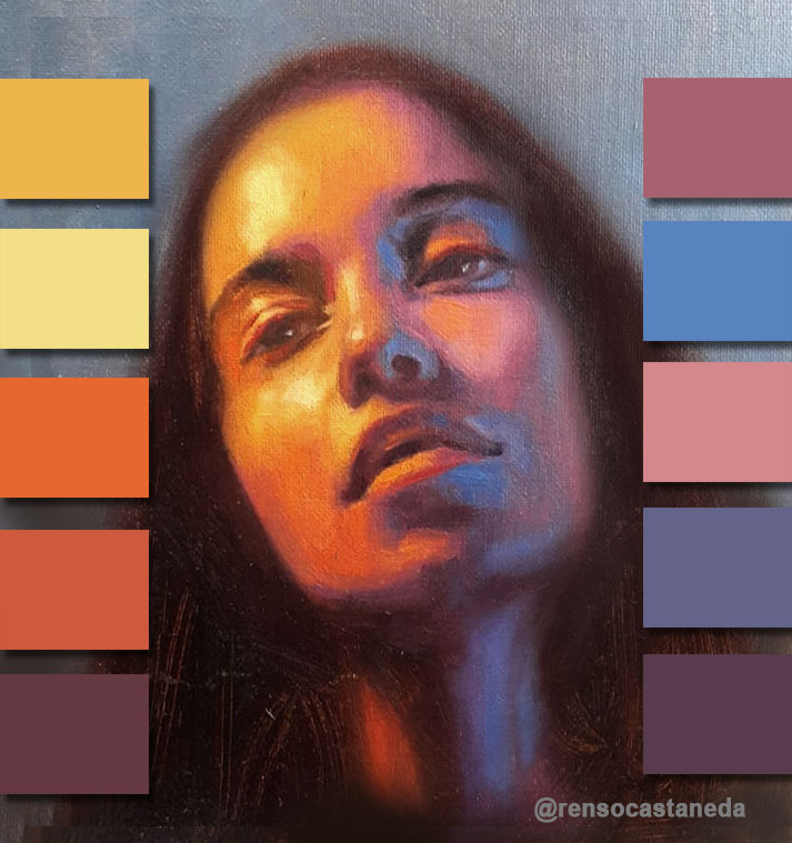
Finally, I assess the contrast between light and shadow, this time paying attention to color temperature. I observe whether the light is warm or cool and whether the contrast is strong or subtle. I also analyze warm, cool, and neutral colors—especially the neutrals, as they are the trickiest to identify. I take special care when mixing grays to ensure they remain balanced and harmonious.
- Atmospheric perspective (Cooler tones recede, warmer advance)
- Reflected light (As taught by Richard Schmid, shadows contain their light source’s complement)
- Neutral orchestration (Sargent’s “mud” was actually carefully balanced grays)
Bonus: Old Masters’ Preparation Secrets
- Rubens’ Sketch System: Created small oil sketches (modelli) to plan compositions
- Velázquez’s Ground Layers: Built complex undertones with colored imprimatura
- Turner’s Notebooks: Filled 300 sketchbooks with light observations before painting
Why This Process Matters
As art historian Ernst Gombrich noted, “The artist learns not to copy, but to see.” This analytical approach channels your creativity effectively.