Introduction
Welcome to my website! Today, I’m going to walk you through the process of painting a portrait, with a special focus on color theory. Color is one of the most powerful tools in an artist’s arsenal, and understanding how to use it effectively can transform your work. Whether you’re a beginner or an intermediate artist, this guide will help you create a realistic portrait while mastering the principles of color. Let’s dive in!
Main Points
1. Materials and Setup
- Brushes: I primarily use synthetic brushes, especially thick ones for the initial layers. For fine details, I switch to smaller brushes like liner brushes (size 00 or 0).
- Colors: My palette includes Titanium White, Cadmium Yellow, Cadmium Orange, Cadmium Red, Permanent Alizarin Crimson, Raw Umber, Cobalt Blue, and Lamp Black. These colors allow me to mix a wide range of skin tones and shadows.
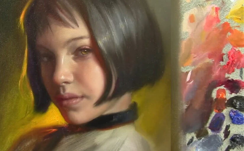
- Reference Photo: The photograph I’m using is linked in the description box. I always keep it next to my canvas for easy reference. I also use a toned gray canvas, which helps me judge values more accurately.
2. Starting the Painting
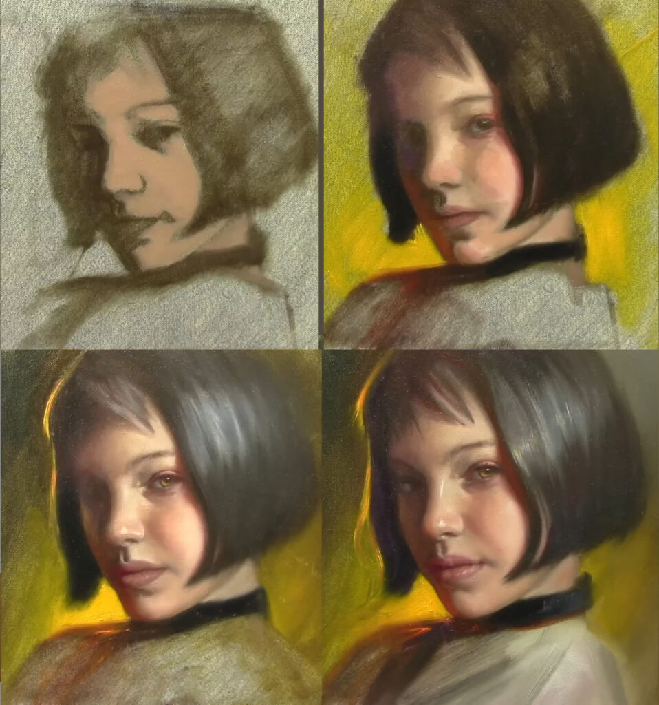
- Sketching: Sometimes I start with a detailed drawing, but today I’m diving straight into painting with Raw Umber. This helps me establish the values (lights and shadows) early on.
- Proportions: I always keep proportions in mind. For example, the distance from the eyebrow to the bottom of the nose is usually the same as from the nose to the chin. This helps maintain accuracy in the portrait.
- Squinting: Squinting helps me see the basic shapes and values more clearly. It simplifies the image into light, mid-tone, and shadow areas.
3. Understanding Color Theory
- Color Wheel: The color wheel is the foundation of color theory. It consists of primary colors (red, blue, yellow), secondary colors (green, orange, purple), and tertiary colors (mixtures of primary and secondary colors).
- Warm and Cool Colors: Warm colors (reds, oranges, yellows) advance in a painting, while cool colors (blues, greens, purples) recede. This is crucial for creating depth.
- Complementary Colors: Colors opposite each other on the color wheel (e.g., red and green, blue and orange) create strong contrast and can make each other appear more vibrant.
- Simultaneous Contrast: This is the phenomenon where colors influence each other when placed side by side. For example, a gray will appear warmer next to a cool color and cooler next to a warm color.
4. Building the Portrait
- Layering: I start with a thin layer of Raw Umber to block in the shadows and mid-tones. This creates a foundation for the portrait.
- Skin Tones: For the skin, I mix Cadmium Orange, Raw Umber, and White. I keep the colors simple at first, focusing on getting the mid-tones right before adding highlights and darker shadows.
- Highlights: I use Titanium White with a touch of Cadmium Yellow for warm highlights.
- Shadows: Shadows are created by adding Raw Umber and a touch of Cobalt Blue to cool them down.
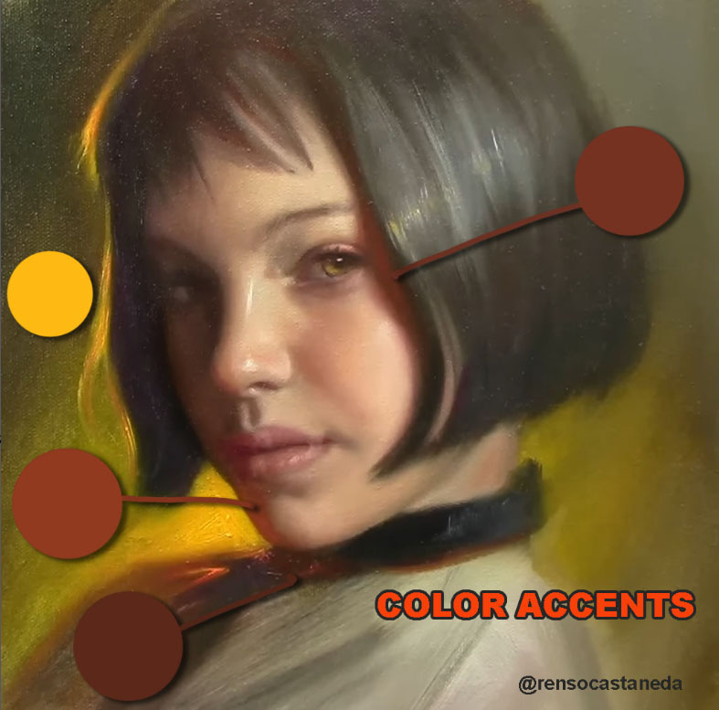
- Reddish Areas: Areas like the cheeks, nose, and chin often have a reddish tint. I mix Cadmium Red with a bit of White and Raw Umber for these areas.
- Background: The background color can significantly affect the portrait. I choose a warm, yellowish tone to complement the skin tones and create contrast. This is an example of color harmony.
5. Refining Details
- Eyes and Mouth: These features require careful attention. I use smaller brushes for details like the eyelashes and lips. I also pay close attention to the highlights in the eyes to make them look alive.
- Eyes: The eyes often have a hint of green or blue in the shadows, especially near the tear ducts. I use a mix of Cobalt Blue and Raw Umber for this.
- Mouth: The lips have a reddish tone, but I also add a touch of Alizarin Crimson to make them more vibrant.
- Hair: Hair is painted in layers. I start with dark tones (Lamp Black and Raw Umber) and gradually add lighter strands (Raw Umber and White) to create depth and texture.
- Blending: I use a fan brush to soften edges and blend colors smoothly, especially in areas like the cheeks and neck.
6. Color and Contrast
- Warm and Cool Colors: I balance warm and cool tones to create a sense of depth. For example, I add a touch of green to the shadows on the face to contrast with the warm highlights. This is an example of simultaneous contrast.
- Highlights: I use Titanium White mixed with a bit of yellow for the brightest highlights. This makes the skin look more luminous.
- Final Adjustments: I step back frequently to check the overall composition. Sometimes I darken the background to make the face pop or adjust the shadows to enhance the three-dimensional effect.
7. Advanced Color Techniques
- Glazing: This is a technique where a thin, transparent layer of paint is applied over a dry layer. It’s great for adjusting colors without losing the underlying details.
- Scumbling: This involves applying a thin, opaque layer of paint over a dry layer to create texture or soften colors.
- Color Temperature: Understanding color temperature is key. For example, warm light creates cool shadows, and cool light creates warm shadows. This is known as local color and is essential for realism.
Conclusion
Painting a portrait is a rewarding but challenging process. It requires patience, practice, and a good understanding of proportions, values, and color theory. Today’s session took about three hours, and while I’m happy with the result, I know there’s always room for improvement. Remember, art is a journey, and every painting teaches us something new.
Key Takeaways:
- Start with values: Focus on lights and shadows before diving into details.
- Keep proportions in mind: This ensures the likeness of the portrait.
- Balance warm and cool tones: This adds depth and realism to the painting.
- Use color theory: Understanding complementary colors, simultaneous contrast, and color temperature can elevate your work.
- Practice makes perfect: Don’t be afraid to make mistakes and learn from them.
Thank you for joining me today! If you enjoyed this tutorial, don’t forget to like, subscribe, and leave a comment. I’d love to hear your thoughts and answer any questions you have. Until next time, keep painting and exploring your creativity!
Recommended Reading:
For those interested in diving deeper into color theory, I highly recommend the book “Color Theory” by Johannes Itten. It’s a comprehensive guide that covers everything from the basics to advanced techniques. You can find a free PDF version online, but I encourage you to read it multiple times to fully absorb the concepts.
Happy painting! 🎨