This article is for Beginners
First, let’s start with what not to do. I once saw a TV program where a craft instructor demonstrated painting techniques. Their advice for lightening and darkening colors was simply to use white and black—it works but painters have a different approach. While white is often used to lighten colors, black should not be used to darken them unless we are painting something truly black.
Here’s why: If we lighten every color with white, we drain the life from them, leaving them pale, milky, and dull. If we darken with black, we kill the vibrancy and depth of the colors, making them look muddy and lifeless.
For example, if we want to lighten green, adding white will create a faded, washed-out green. Instead, using yellow will produce a much livelier and more natural effect. On the other hand, if we try to lighten blue with yellow, we’ll end up with green—so in that case, white is the best choice. If we lighten red with white, we get pink, whereas adding yellow creates orange. From there, we can further adjust with a balance of yellow and a touch of white.
The choice of how we lighten colors also depends on the lighting in our scene. Imagine we’re painting a still life:
- On a bright, sunny day, sunlight dominates, meaning we’ll use more yellow to brighten the colors.
- In a softly lit indoor scene, the lighting is more muted, requiring more white for highlights. However, we must be careful—if an object is naturally dark, the light won’t make it much brighter, so we won’t need as much yellow or white to depict its highlights.
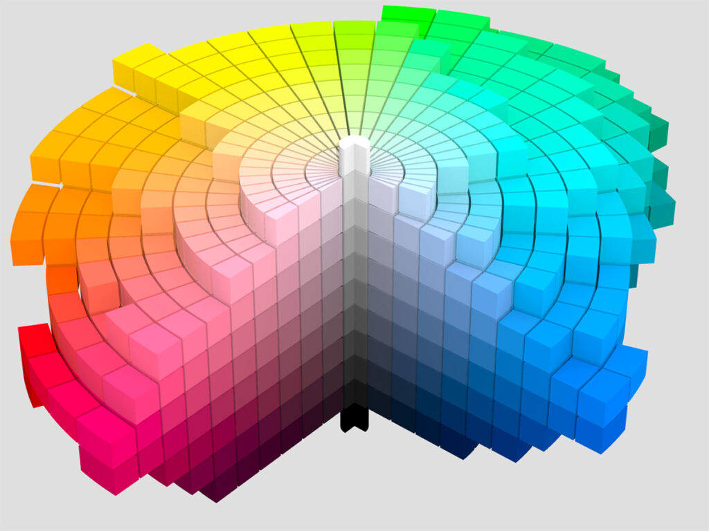
Sounds a bit complicated? That’s because color theory in painting is one of the most crucial—and challenging—areas to master. There are many factors to consider.
Lightening Colors: Tone vs. Color Contrast
Another way to create the illusion of brightness is through contrast. This brings up an important question: Are we tonal painters or colorists?
- Tonal painters focus on the contrast between light and shadow.
- Colorists emphasize the vibrancy and interaction of colors themselves.
Here’s an example: A colorist would brighten an object by using more yellow and increasing color contrast. If we have an orange object against a blue background, the complementary contrast will naturally make the orange appear brighter and more intense.
A tonal painter, on the other hand, would rely on light and dark contrast. If they were painting a yellow object, they might surround it with darker colors to make the yellow appear lighter by comparison. This demonstrates how colors can be brightened in multiple ways.
Darkening Colors: A Better Approach
Darkening a color follows a fundamental rule in color theory: To create a rich, deep shade, we mix the color with its complement and add a touch of blue—typically ultramarine blue.
By following this method, we achieve vibrant dark colors instead of dull, lifeless tones. Imagine darkening yellow with black—it results in a murky, greenish color that looks unnatural. But if we darken yellow by mixing it with its complementary color (violet), we get a variety of rich ochres, depending on how much violet is added. Try it and see the difference!