The Day My Teacher Took Away My Black and White Paints – and How I Learned to Avoid Muddy Colors.

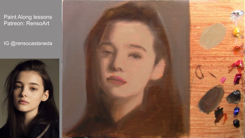
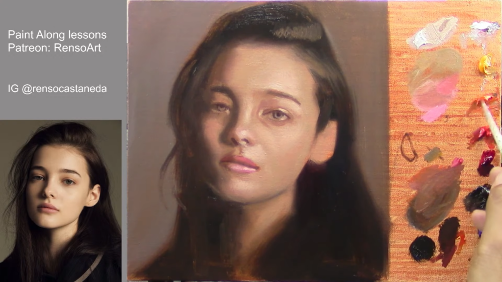
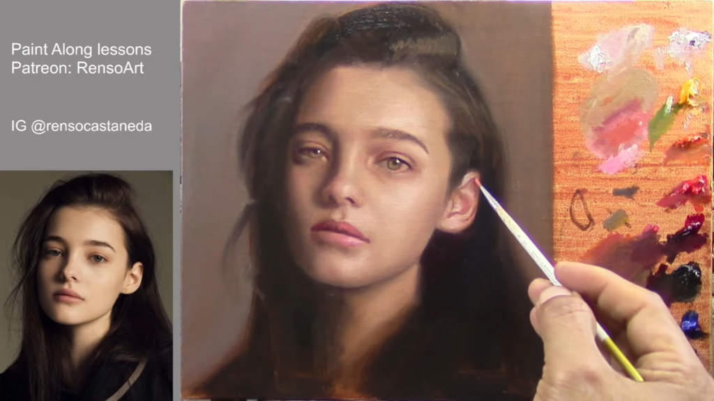
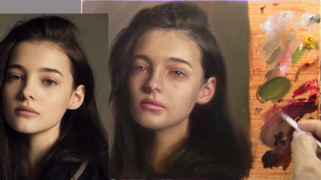
(How to avoid muddy colors when mixing paint)

I still remember my first year in art school. I was working on my second still life, and while the volume and structure of my painting were fine, my colors looked milky, and my shadows were muddy and dirty.

As my teacher walked around observing my classmates’ paintings, he stopped at my spot and said:
“Use less white and black.”

The next day, he said the same thing. And the day after that, he took my tubes of black and white paint!

Instead, he handed me a tiny amount of white and told me:
“To lighten your colors, use only lemon yellow and this little bit of white. To darken, use ultramarine blue.” and think about value contrast is not just about color mixing is about color harmony too (this is going to be for another article)

I thought it was impossible—how could I paint without black and white? But I had no choice. For the next three days, I painted this way.

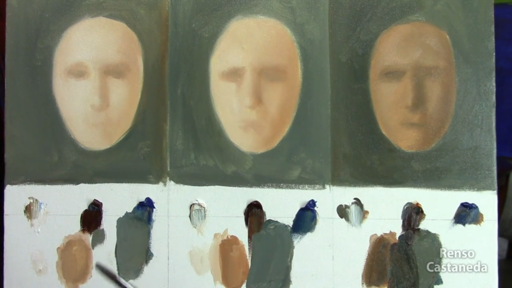
At first, it was frustrating. I had to pay more attention to color mixing. To lighten colors, I used yellow with just a tiny bit of white. Darkening was easier because ultramarine blue is naturally deep.

Then, something amazing happened.

Right before my eyes, my painting became vibrant, clean, and full of life. No more muddy colors—just pure, brilliant color, obviously not on the whole painting, one more thing I learned was about the proportions of colors on a painting, gray down colors (muddy colors 60%), neutral colors(30%) and pure accents(10%).

When my teacher saw my finished painting, he finally gave me my paints back and said:
“You need to learn to control these two colors. It won’t be easy, but remember this lesson every time you squeeze white and black onto your palette.”


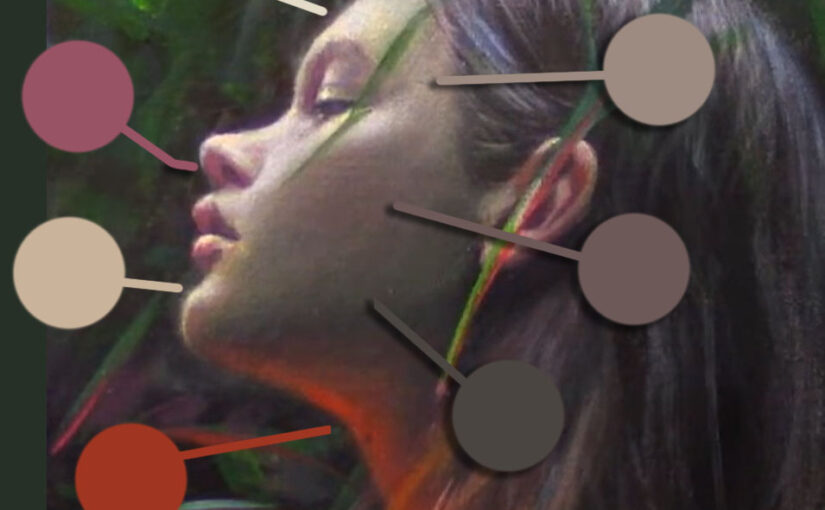
Understanding White and Black to avoid muddy colors

White and black are powerful but tricky.

🖌 Too much white → Colors become opaque and milky. Even shadows can turn cloudy, making the painting look dull.
🎨 Too much black → Shadows become heavy and dirty, instead of transparent and natural-looking.

We often overuse these colors without realizing it, so controlling them takes practice.


How to Control Black and White in Your Paintings

Use Alternative Colors

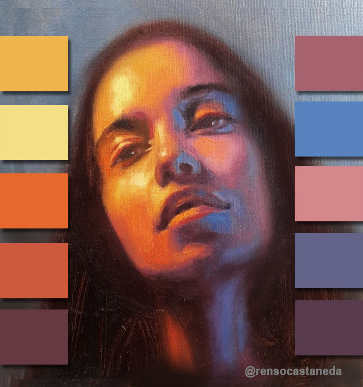
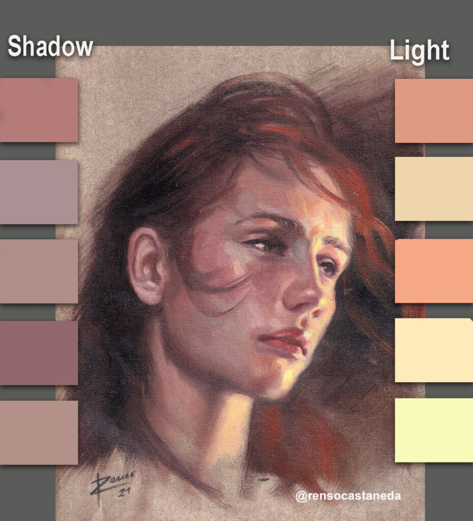
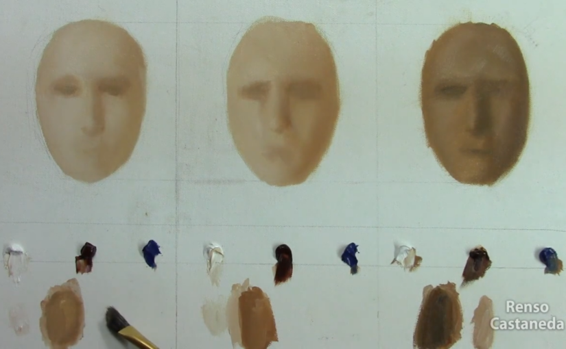
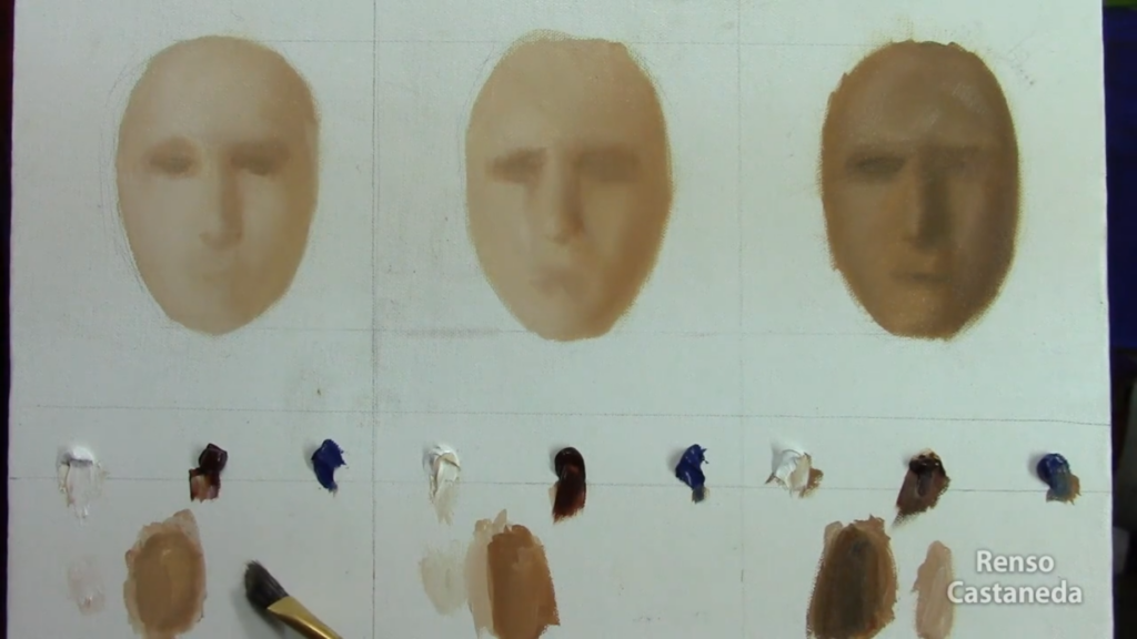
  • For shadows: Burnt umber + ultramarine blue → a deep, dark tone close to black.
  • For highlights: Naples yellow + lemon yellow → a warmer, fresher light instead of a flat white.

Use Complementary Colors for Shadows
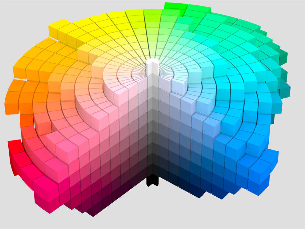
Instead of black, use the opposite color on the color wheel to create shadows:

  • Orange shadow → Add blue
  • Red shadow → Add green
  • Yellow shadow → Add purple

Be Careful with White in Shadows
Adding too much white to a shadow will make it flat and lifeless. Shadows should be transparent and glowing, not cloudy.


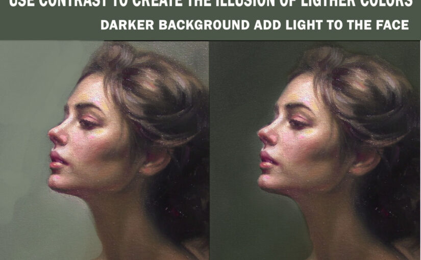
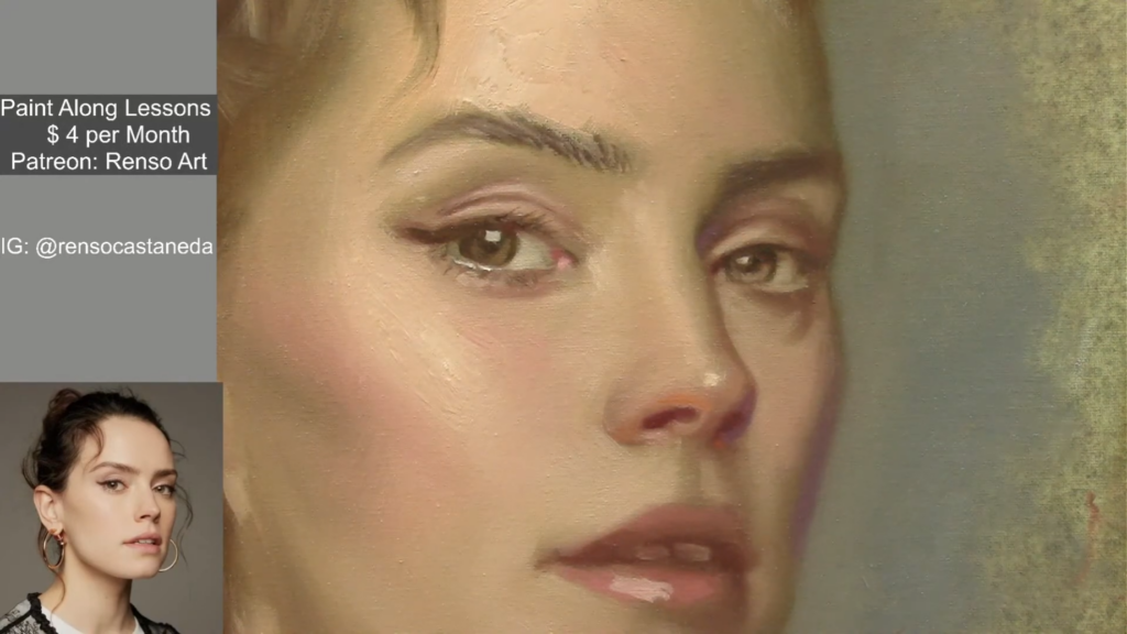
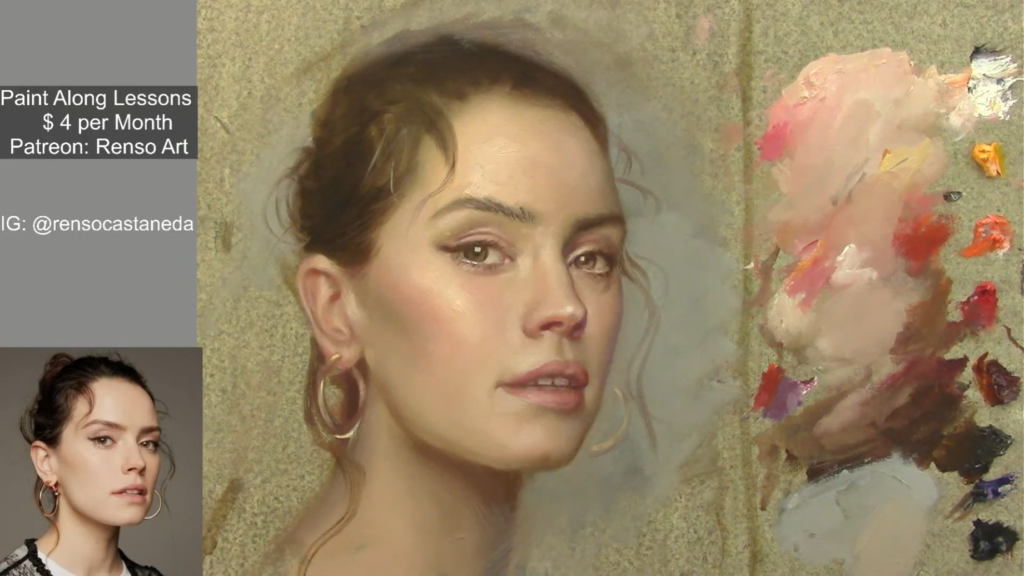
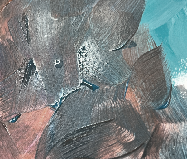
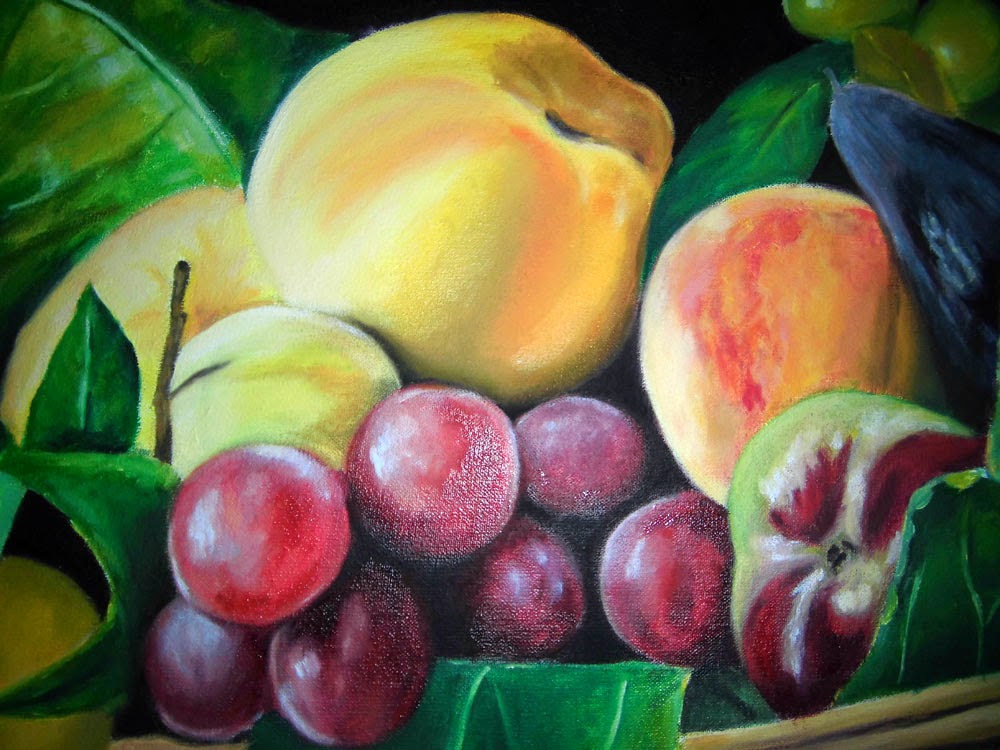
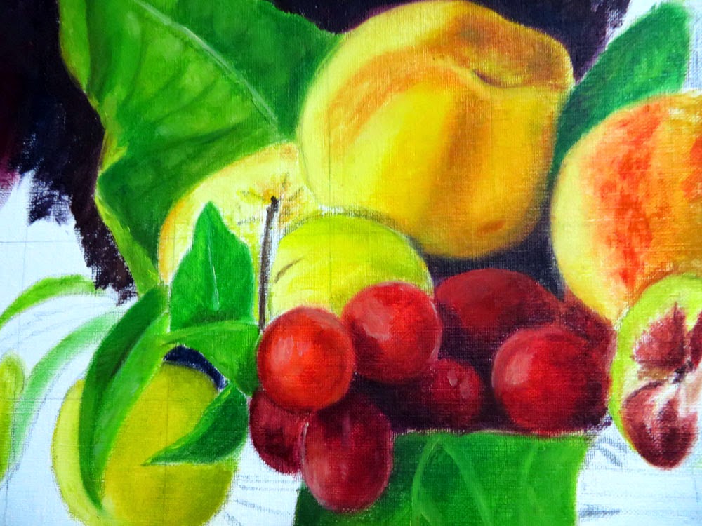
A Student’s Painting: Before and After

📌 In the first painting, the artist used too much white and black.

  • The lights look milky.
  • The shadows appear heavy and dull.
  • The colors of the grapes are muddy and lifeless.

📌 In the second painting, the artist used Naples yellow instead of too much white and avoided pure black in the shadows.

  • The colors are cleaner and more vibrant.
  • The shadows are transparent and glowing.
  • Even though the painting is unfinished, it already looks fresh and full of life.
muddy colors

Final Thoughts

Learning to control white and black takes time and practice, but once you do, your paintings will become more vibrant, cleaner, and full of light.

🌟 Next time you mix colors, remember my teacher’s lesson. Instead of reaching for black and white right away, try using their colorful alternatives first. Your paintings will thank you! 🎨✨

Support my Journey At not cost to you buying Art materials from my Amazon Store: https://www.amazon.com/shop/rensoart

Why is it so hard to capture shape and volume?

Struggling to define volume and shape is one of the most common challenges for painting students. Volume represents the three-dimensionality of objects, making them appear real to our eyes. If your paintings lack volume, it means your eye is not yet fully trained to perceive and replicate tonal values accurately.


Training Your Eye to See Volume

Developing volume in painting requires visual training. As artists, we spend countless hours observing color mixtures, objects, textures, and transparencies. But simply looking at things isn’t enough—we must actively analyze details, paying close attention to:

  • Shadows
  • Highlights
  • Reflections
  • Contrast levels

This ability to observe and interpret tonal variations is what allows us to create depth and realism in our work.


Using a Cube to Understand Tonal Values

To improve your understanding of tonal values, try painting a simple cube in any color of your choice, preferably using tempera or acrylic paint. These dry quickly, allowing you to repaint as needed.

The cube serves as a visual reference for the three main tones used in painting:

  1. Shadow (darkest side)
  2. Midtone (middle tone)
  3. Light (brightest side)

If you’re painting a lemon, for example, observing a cube in the same color will help you distinguish the necessary shades. To enhance brightness, simply add white to your mixture.

After the cube you can move to this one:


Mastering Soft Transitions and Blending

Achieving the smooth, curved surface of a lemon—or any rounded object—depends on practice with brushwork, especially blending techniques. Start with the cube exercise to grasp the basics of tonal contrast, then gradually introduce more variations to your color mix. Remember, not all lemons are purely yellow—some have greenish areas, subtle color shifts, and reflections.

With experience, you can refine your technique using glazes, allowing you to create stunning, realistic artwork.


Final Thoughts

Defining volume and shape takes time and practice, but training your eye to see and replicate tonal values is the key. By starting with simple exercises like the cube, you’ll build a strong foundation that will improve your ability to paint more complex subjects with depth and realism.

Keep practicing, and soon, your paintings will gain the three-dimensionality that makes them come to life! 🎨✨

values and shapes in painting

Support my Art Journey At not cost to you buying Art materials from my Amazon Store: https://www.amazon.com/shop/rensoart


Warm and Cool Colors in Painting

Think back to a day at the beach—just before sunset. The sun’s golden light spreads across the sky, bathing everything in yellows and oranges. Meanwhile, the sand, once warm and golden at noon, now takes on a violet or purple hue as shadows grow.

Just writing about this scene brings back memories for me. It’s a perfect example of color temperature—the relationship between warm and cool colors that we see around us every day. Sometimes the contrast is subtle, other times it’s strong, but it’s always present. As artists, our job is to capture this balance on canvas.

Warm and Cool Colors

Understanding Color Temperature

In color theory, there is a fundamental principle:
If the light is warm, the shadows must be cool.
If the light is cool, the shadows must be warm.

This contrast in temperature is essential to creating a sense of volume, form, and realism in paintings. If we ignore this rule, our artwork will feel flat or unnatural—even if viewers can’t pinpoint why.

It’s easy to get lost in the flow of painting and forget about theory, but color temperature should always be in the back of your mind—like a soft whisper guiding your brush.


What Are Warm and Cool Colors?

The easiest way to understand color temperature is to think about real-world temperature associations:

Warm and cool colors are categories of colors based on their visual temperature associations. They influence mood, perception, and design aesthetics.

Warm Colors

  • Examples: Reds, oranges, yellows, and some browns.
  • Associations: Fire, sunlight, energy, passion, excitement, and coziness.
  • Effects: Feel inviting, stimulating, and attention-grabbing. Can make spaces feel smaller and more intimate.

Cool Colors

  • Examples: Blues, greens, purples, and some grays.
  • Associations: Water, sky, ice, calmness, serenity, and relaxation.
  • Effects: Create a sense of space (receding effect), tranquility, and professionalism. Can feel refreshing or subdued.
Warm and Cool Colors

Key Differences:

AspectWarm ColorsCool Colors
MoodEnergetic, vibrantCalm, soothing
Spatial EffectAdvance (feel closer)Recede (feel farther)
Common UsesFood, entertainment, autumn themesHealthcare, tech, winter themes

Exceptions & Nuances:

  • Some colors can be warm or cool depending on undertones (e.g., a red with blue undertones may feel cooler).
  • Neutral colors (white, black, gray, beige) can lean warm or cool based on their base hues.

Understanding these categories helps in art, interior design, branding, and fashion to evoke specific emotions and effects.


Great! Using warm and cool colors effectively in portrait painting can enhance depth, mood, and realism. Here’s how to apply them:


1. Skin Tones: Balancing Warm & Cool

Human skin is never just one temperature—it’s a mix of both:

  • Warm areas (where blood flows closer to the skin):
  • Cheeks, nose, ears, fingertips.
  • Use peachy pinks, golden yellows, or reddish tones.
  • Cool areas (where shadows or light scatter):
  • Under the chin, eye sockets, sides of the face, neck.
  • Use muted blues, greens, or lavender grays.

Tip: Shadows aren’t just darker—they’re often cooler. A common mistake is using only black/brown for shadows, which flattens the portrait.


warm and cool colors in painting

2. Background & Lighting

  • Warm light (e.g., sunlight, candlelight):
  • Casts warm highlights but creates cooler shadows (due to contrast).
  • Cool light (e.g., overcast sky, moonlight):
  • Creates bluish highlights but warmer shadows.

Example: A portrait lit by a sunset might have:

  • Warm orange-gold light on one side.
  • Cool purple-blue shadows on the other.

3. Emotional Impact

  • Warm dominance: Feels lively, passionate, or intense (e.g., a fiery red background for drama).
  • Cool dominance: Feels serene, melancholic, or detached (e.g., a blue-green backdrop for a pensive mood).

Pro Tip: Use temperature contrast to guide the viewer’s eye. A warm face against a cool background pops forward.


4. Color Mixing Tricks

  • Avoid muddy skin tones: Mix warm and cool pigments carefully. For example:
  • Warm shadow = Burnt Sienna + Cadmium Red.
  • Cool shadow = Ultramarine Blue + Alizarin Crimson.
  • Highlight with opposites: A touch of cool (e.g., cerulean) in warm highlights adds vibrancy.

5. Artist Examples

  • Rembrandt: Used warm golden lights against deep cool browns for dramatic depth.
  • John Singer Sargent: Balanced warm skin tones with cool, loose background strokes.

Exercise: Paint a portrait using only warm colors for light areas and cool for shadows (or vice versa) to see the effect.

Final Thoughts

Understanding warm and cool colors is one of the most powerful tools in painting. It helps create depth, atmosphere, and emotion. Mastering this concept will take your artwork to the next level—so keep practicing, observe nature, and let color theory become second nature!

🎨 What are your favorite warm and cool color combinations? Let’s discuss! 😊

“You can support my art journey for free by shopping art supplies through my Amazon store—thanks a ton!“: https://www.amazon.com/shop/rensoart


How to Lighten and Darken Colors using Colors and Contrast

First, let’s start with what not to do. I once saw a TV program where a craft instructor demonstrated painting techniques. Their advice for lightening and darkening colors was simply to use white and black—it works but painters have a different approach. While white is often used to lighten colors, black should not be used to darken them unless we are painting something truly black.

Here’s why: If we lighten every color with white, we drain the life from them, leaving them pale, milky, and dull. If we darken with black, we kill the vibrancy and depth of the colors, making them look muddy and lifeless.

For example, if we want to lighten green, adding white will create a faded, washed-out green. Instead, using yellow will produce a much livelier and more natural effect. On the other hand, if we try to lighten blue with yellow, we’ll end up with green—so in that case, white is the best choice. If we lighten red with white, we get pink, whereas adding yellow creates orange. From there, we can further adjust with a balance of yellow and a touch of white.

The choice of how we lighten colors also depends on the lighting in our scene. Imagine we’re painting a still life:

  • On a bright, sunny day, sunlight dominates, meaning we’ll use more yellow to brighten the colors.
  • In a softly lit indoor scene, the lighting is more muted, requiring more white for highlights. However, we must be careful—if an object is naturally dark, the light won’t make it much brighter, so we won’t need as much yellow or white to depict its highlights.

Sounds a bit complicated? That’s because color theory in painting is one of the most crucial—and challenging—areas to master. There are many factors to consider.

The answer is in Contrast

Another way to create the illusion of brightness is through contrast. This brings up an important question: Are we tonal painters or colorists?

  • Tonal painters focus on the contrast between light and shadow.
  • Colorists emphasize the vibrancy and interaction of colors themselves.

Here’s an example: A colorist would brighten an object by using more yellow and increasing color contrast. If we have an orange object against a blue background, the complementary contrast will naturally make the orange appear brighter and more intense.

A tonal painter, on the other hand, would rely on light and dark contrast. If they were painting a yellow object, they might surround it with darker colors to make the yellow appear lighter by comparison. This demonstrates how colors can be brightened in multiple ways.

Value Contrast:

Color Contrast:

Darkening Colors using complementary colors

Darkening a color follows a fundamental rule in color theory: To create a rich, deep shade, we mix the color with its complement and add a touch of blue—typically ultramarine blue.

By following this method, we achieve vibrant dark colors instead of dull, lifeless tones. Imagine darkening yellow with black—it results in a murky, greenish color that looks unnatural. But if we darken yellow by mixing it with its complementary color (violet), we get a variety of rich ochres, depending on how much violet is added. Try it and see the difference!

Support my Journey At not cost to you buying Art materials from my Amazon Store: https://www.amazon.com/shop/rensoart


How to mix Basic Skin Colors for Beginners


While this technique isn’t a universal method for mixing skin tones in every portrait, it can be a helpful starting point, particularly for Alla Prima painting. If you’re a beginner aiming for quick and effective results, practicing with a limited palette to create skin colors can be an excellent way to build your skills and confidence.

The Colors You’ll Need

This technique is very simple, and the key is learning how to create natural-looking skin tones with minimal colors. Here’s all you need:

  • Titanium White
  • Burnt Sienna
  • Ultramarine Blue

That’s it! No additional colors are needed to paint basic skin colors.

Understanding Skin Colors

The skin tone you achieve will depend entirely on the amount of white in your mix:

  • For fair skin → More white, a little sienna, and almost no blue.
  • For medium skin → A balanced mix of white, sienna, and a bit of blue.
  • For dark skin → Less white, more sienna, and more blue.

💡 Tip: Mixing just white and sienna results in an unnatural, crude skin tone. Adding a touch of ultramarine blue neutralizes the mix, creating a more natural skin color.

The Importance of a Strong Foundation in Drawing

Before focusing on painting skin tones, you must first have a well-structured face drawing. If the structure is incorrect, no matter how well you handle volume, color, or lighting, the portrait won’t look right.

Once the drawing is solid, you need to understand volume—this is what creates the three-dimensionality of the head, eyes, nose, and facial features.

Practical Exercises

How to mix Basic Skin Colors for Beginners

Here’s how the skin tones change with different color ratios:

1️⃣ First Exercise

  • Colors: Titanium White + Burnt Sienna (almost no blue)
  • Result: A very fair skin tone

2️⃣ Second Exercise

  • Colors: Less white, the same amount of sienna, and a little more blue
  • Result: A more balanced, natural skin tone

3️⃣ Third Exercise

  • Colors: Even less white, more sienna, and more blue
  • Result: A darker skin tone

At the end, you can apply glazes to add color variations and depth to your painting.

How to mix Basic Skin Colors for Beginners

I hope this simple guide helps you start painting portraits and achieving skin tones easily! 🎨😊

Support my Art Journey At not cost to you buying Art materials from my Amazon Store: https://www.amazon.com/shop/rensoart


Why you should Start Painting in Black and White?

When we observe the world around us, we see an abundance of colors, shadows, highlights, and reflections. As painters, our goal is to capture reality and translate it onto a flat, opaque surface—our canvas—using colored pigments. To successfully recreate reality, we must master three fundamental elements: drawing, volume, and color.

  • Drawing allows us to represent objects proportionally and realistically.
  • Volume creates the illusion of three-dimensionality.
  • Color brings life to the painting.

While drawing is crucial, today’s focus is on volume.

Training Your Eye to See Tonal Values

To develop an understanding of volume, we must train our eyes to recognize tonal values—the different shades of light and dark that define forms. The best way to do this is by starting with white objects, as they contain no color and only reflect a range of grays.

By painting white objects, we eliminate the distraction of color and concentrate solely on accurately reproducing the gradations of light and shadow. Once we become comfortable with this process, we can transition to color, which requires a deep understanding of theory and practice. If we don’t first master values, we cannot expect good results when working with color.

The Importance of Patience in Learning

From my own experience, I know that most art students want immediate results. We all want to see our paintings come to life quickly, but the reality is that painting requires time, practice, and patience.

A great way to start is by setting up a simple still life using a white cloth and a few geometric shapes painted white. If this isn’t possible, look for black-and-white photographs with strong lighting contrast—avoid frontal lighting, as it flattens forms. Instead, choose images where you can clearly see the transition from light to shadow and the full range of tonal values.

By consistently practicing with white objects, we will train our eyes and hands to achieve the correct sense of volume. Then, when we introduce color, we won’t lose our sense of form.

Getting Started: The Value Scale

values scale

To begin, you’ll only need black and white paint. Start by creating a value scale of at least six tones—though you’ll likely end up with many more shades of gray. The goal is to match the values of each area in your reference image, a process that takes time and effort but will ultimately lead to great results.

  • If you’re a beginner, start by painting simple cubes, spheres, cylinders and cones to practice shading.
  • If you have some experience, challenge yourself with a more complex reference image.
  • If you’ve been painting for a while but struggle with volume, try a more advanced exercise requiring precise value control and smooth blending.

Final Thoughts

Mastering volume in black and white is an essential step in becoming a strong painter. Once you can successfully depict form using tonal values, transitioning to color will be much easier, and your paintings will look more realistic and well-structured.

So, take your time, practice consistently, and enjoy the process of learning!

Step-by-Step Portrait Painting Tutorial: Techniques, Tips & Viewer Q&A

Portrait painting is a joyful dance of observation, technique, and patience. In this article, I’ll take you behind the scenes of my creative process, sharing tips and tricks that have brought so much life to my work. Whether you’re just starting your artistic journey or looking to take your skills to the next level, these insights will help you capture the heart and soul of your subject. Let’s create something beautiful together


1. Starting with the Basics: Simplifying Complex Forms

Every portrait begins with a blank canvas and a vision. To tackle the complexity of the human face, I start by breaking it down into simple shapes. For this portrait, I began by sketching the forehead as a triangle and the rest of the features as simple geometrical shapes. This approach helps establish proportions and placement before diving into details.

Step-by-Step Portrait Painting

2. The Power of Squinting: Seeing Values and Shapes

Throughout the process, I squint my eyes—a habit I’ve developed to simplify what I see. Squinting helps me focus on values and shapes, stripping away unnecessary details. It’s a trick I highly recommend to students. By training your eye to see the big picture first, you can avoid getting lost in the minutiae.

Step-by-Step Portrait Painting

3. The Classical Approach: Underpainting and Layering

One of my favorite techniques is underpainting with green. This classical method, often used by the Old Masters, creates a luminous base that adds depth to the final piece. As I layered the paint, I aimed for a museum-like quality—soft edges, rich tones, and a timeless feel.

For skin tones, I mixed burnt umber, cadmium red, and yellow, gradually building up the layers. The goal was to achieve a translucent effect, allowing the green undertones to subtly shine through. This technique requires patience and a keen eye for color harmony, but the results are worth it.

Step-by-Step Portrait Painting

4. Refining the Details: Drawing and Painting Simultaneously

As I progressed, I switched between drawing and painting modes. Using a fine liner brush, I refined the features, paying close attention to the eyes, nose, and mouth. The key is to simplify what you see—focus on shapes and values rather than getting bogged down by details.

For the eyes, I used pure black for the pupils and added subtle highlights to create depth. The nose and mouth were shaped using simple forms, with careful attention to light and shadow. This step-by-step approach ensures accuracy and likeness.

Step-by-Step Portrait Painting

5. The Importance of Softness: Blending and Transitions

Soft edges are crucial for achieving a lifelike appearance. I used a clean brush to blend the colors, creating smooth transitions between light and shadow. This step is especially important for areas like the cheeks and chin, where the skin should appear soft and natural.

I also paid close attention to the lightest highlights, placing them on the tip of the nose and the cheeks. These subtle touches added warmth and dimension to the face. Remember, portrait painting is about balance—knowing when to add detail and when to step back.

Step-by-Step Portrait Painting

6. Final Touches: Adjusting Values and Perfecting Likeness

As I neared the end of the painting, I stepped back to assess the overall composition. Using Photoshop, I compared my painting to the reference photo, identifying areas that needed adjustment. Darkening the shadows and adding more light to the highlights helped refine the likeness.

The final touches included softening edges, adding subtle details to the eyes, and adjusting the background to complement the portrait. These small changes made a big difference, bringing the painting to life.

Step-by-Step Portrait Painting

7. Lessons from the Studio: Patience and Practice

Portrait painting is a journey of patience and practice. It’s about embracing the process, learning from mistakes, and continually refining your skills. As I worked on this portrait, I was reminded of the importance of observation, technique, and perseverance.

To all the art students and portrait enthusiasts reading this, I encourage you to keep practicing. Experiment with techniques, learn from your mistakes, and never stop creating. Every brushstroke is a step forward in your artistic journey.


Viewer Questions and Answers

Throughout the painting session, I received several questions from viewers. Here are some of the most common ones, along with my answers:

Q: What kind of brushes do you use?
A: I use synthetic brushes for most of my work. They’re durable, easy to clean, and work well with both oil and acrylic paints. For blending, I prefer softer brushes to create smooth transitions.

Q: Do you recommend using a grid for portraits?
A: Absolutely! Grids are a great tool for ensuring accurate proportions, especially for beginners. They help break down the face into manageable sections and make it easier to capture the likeness.

Q: How do you clean your brushes when painting with oils?
A: I use a combination of turpentine and linseed oil to clean my brushes. After wiping off excess paint, I dip the brushes in turpentine, then rinse them with soap and water. It’s important to keep your brushes clean to maintain their shape and longevity.

Q: What’s your opinion on glazing?
A: Glazing is a fantastic technique for adding depth and richness to a painting. It involves applying thin, transparent layers of paint over dry layers. I often use glazes to enhance skin tones or create subtle color shifts. Just remember to let each layer dry completely before adding the next.

Q: How do you achieve realistic skin tones?
A: Skin tones are all about layering and blending. I start with a neutral base color and gradually build up warmer and cooler tones. Pay attention to the light source and how it affects the shadows and highlights on the face.

Q: Do you recommend going to art school to learn painting?
A: Art school can be a great way to learn, but it’s not the only path. Many artists are self-taught and learn through practice, online tutorials, and studying the work of others. The key is consistent practice and a willingness to learn from your mistakes.


Conclusion: Art as a Journey

Painting is more than just a skill; it’s a way of seeing the world. It’s about finding beauty in the ordinary, turning mistakes into opportunities, and sharing stories through your work. Whether you’re painting a portrait or exploring other subjects, remember that every piece you create is a reflection of your unique perspective.

Keep painting, keep learning, and most importantly, enjoy the process.


How to Control the pressure when you apply paint

Have you ever noticed how kids press really hard when they draw or paint? They look so confident, as if they know exactly what they’re doing.

Adults, however, are different. Some apply too much pressure, while others barely touch the canvas, as if they’re afraid of making a mistake. The key to mastering brushstrokes is learning to control them, deciding when to apply force and when to go softer.


Mastering Brush Control

To create beautiful paintings, you must command your brushes with confidence. The pressure you apply affects everything—from glazing to blending—so developing control is essential.

This skill comes with practice, but I’ve found a few simple exercises that help my students improve quickly.


Step 1: Pencil Pressure Exercise

Before using brushes, start by practicing with a soft pencil (8B or 9B) or charcoal.

Exercise: Create a smooth gradient from dark to light in one single stroke.

  • Press hard for dark values.
  • Release pressure gradually for lighter areas.
  • No repeated strokes! This forces your hand to control pressure in a single movement.

🔹 Do this daily for a week. It will help train your hand to control stroke intensity.


Step 2: Painting a Sphere

Next, apply the same pressure control with a brush and oil paint.

Exercise: Paint a sphere.
1️⃣ First method:

  • Cover the whole sphere in black paint.
  • Add white in the light area and blend.

2️⃣ Second method:

  • Paint the dark and light areas separately.
  • Use a soft brush to blend the transition.

Tools:

  • Use flat, smooth brushes for blending.
  • Keep a separate brush just for softening edges.
  • Finish with a fan brush for a super smooth effect.

🔹 Repeat this exercise several times to develop control over how much pressure you apply with your brushes.


Final Thoughts

By combining both exercises—pencil control and brush blending—you’ll gain better control over your strokes, pressure, and blending in no time.

🎨 With practice, you’ll be able to decide:
✔️ When to use bold, strong brushstrokes.
✔️ When to apply delicate, soft touches.

Mastering this skill will take your oil painting to a whole new level! 🚀

Do Old Brushes Still Have Value? A Painter’s Guide


Mastering the Art of Brushwork: How Worn Brushes Can Elevate Your Painting

This article dives into the fascinating world of brushes, but with a twist—it’s not about the shiny, brand-new ones. Instead, it focuses on the hidden potential of well-used brushes and how they can become your secret weapon for creating stunning effects. While all types of brushes have their place, understanding how to harness the unique qualities of worn brushes can transform your artwork.

Why Understanding Your Materials Matters

Brushes are more than just tools—they’re extensions of an artist’s creativity. Over time, brushes develop their own personality. The bristles wear down, separate, and lose their original shape, but this isn’t a flaw—it’s an opportunity. These changes can unlock effects that new brushes simply can’t achieve.

For instance, I’ve discovered that a specific brand of brushes, after being used for a while, becomes perfect for painting hair. The slightly worn and separated bristles create soft, natural textures that mimic the flow and delicacy of real hair. This effect is nearly impossible to achieve with a stiff, brand-new brush.

The Magic of Worn Brushes

Once a brush reaches its “sweet spot”—that perfect level of wear—I set it aside for specific purposes. Here’s how I categorize my worn brushes:

  • Hair Painting: Perfect for creating soft, flowing strands with natural texture.
  • Soft Fading: Ideal for smooth transitions and gradients.
  • Texture and Porosity: Great for adding depth and realism to surfaces like skin or fabric.
  • Blending and Rubbing: Excellent for seamlessly merging colors and creating subtle transitions.
  • Special Effects: Reserved for unique techniques that require a distinct brush character.

By dedicating worn brushes to specific tasks, you can achieve a level of precision and artistry that new brushes often lack.

Experiment and Explore

The key to mastering this technique is experimentation. Try using your worn brushes on different subjects to see what effects you can create. Here are some ideas to get you started:

  • Portraits: Use worn brushes for soft skin textures, subtle blush, or delicate facial hair.
  • Hair: Achieve natural-looking strands and highlights with slightly frayed bristles.
  • Fabric and Clothing: Create realistic folds, wrinkles, and fabric textures.
  • Flowers: Add delicate petal details and soft gradients.
  • Shrubs and Foliage: Mimic the organic, irregular shapes of leaves and branches.

Knowing When to Let Go

Of course, not every brush can last forever. If a brush becomes too worn out, losing all structure and functionality, it’s time to retire it. But until then, cherish those well-loved brushes—they might just become your most valuable tools.

Final Thoughts

The next time you’re tempted to toss an old brush, think twice. That worn-out tool could be the key to unlocking a new level of artistry in your work. By understanding and embracing the unique characteristics of your brushes, you can create effects that are as unique as your creative vision. So, dig out those old brushes, experiment, and see where they take you—your next masterpiece might just depend on it!

Here Are Some of My Brushes and How I Use Them:

By getting to know your brushes and how they evolve over time, you can take full advantage of their unique characteristics to enhance your paintings. Happy painting! 🎨😊


Capturing Emotion in Portrait Painting: Techniques and Timeless Insights

Portrait painting is a delicate balance of observation, technique, and patience. In this article, I’ll walk you through my process of creating a portrait, sharing key insights and practical tips that can help art students and portrait enthusiasts refine their skills. Whether you’re just starting out or looking to improve, these lessons will guide you in capturing the essence of your subject.


1. Starting with the Basics: Simplifying Complex Forms

Every portrait begins with a blank canvas and a vision. To tackle the complexity of the human face, I start by breaking it down into simple shapes. For this portrait, I began by sketching the forehead as a triangle. This approach helps establish proportions and placement before diving into details.

When painting a baby, I pay close attention to unique facial proportions—eyes are lower, and the head is larger relative to the face. Measuring carefully and using my brush as a guide ensures the center line is balanced. These foundational details are crucial for creating a lifelike portrait.

Mastering Portrait Painting

2. The Power of Squinting: Seeing Values and Shapes

Throughout the process, I squint my eyes—a habit I’ve developed to simplify what I see. Squinting helps me focus on values and shapes, stripping away unnecessary details. It’s a trick I highly recommend to students. By training your eye to see the big picture first, you can avoid getting lost in the minutiae.

For example, when painting the baby’s face, I squinted to identify the lightest highlights and darkest shadows. This allowed me to create a sense of volume and roundness, essential for bringing the portrait to life.

Mastering Portrait Painting

3. The Classical Approach: Underpainting and Layering

One of my favorite techniques is underpainting with green. This classical method, often used by the Old Masters, creates a luminous base that adds depth to the final piece. As I layered the paint, I aimed for a museum-like quality—soft edges, rich tones, and a timeless feel.

For skin tones, I mixed burnt umber, cadmium red, and yellow, gradually building up the layers. The goal was to achieve a translucent effect, allowing the green undertones to subtly shine through. This technique requires patience and a keen eye for color harmony, but the results are worth it.

Mastering Portrait Painting

4. Refining the Details: Drawing and Painting Simultaneously

As I progressed, I switched between drawing and painting modes. Using a fine liner brush, I refined the features, paying close attention to the eyes, nose, and mouth. The key is to simplify what you see—focus on shapes and values rather than getting bogged down by details.

For the eyes, I used pure black for the pupils and added subtle highlights to create depth. The nose and mouth were shaped using simple forms, with careful attention to light and shadow. This step-by-step approach ensures accuracy and likeness.

Mastering Portrait Painting

5. The Importance of Softness: Blending and Transitions

Soft edges are crucial for achieving a lifelike appearance. I used a clean brush to blend the colors, creating smooth transitions between light and shadow. This step is especially important for areas like the cheeks and chin, where the skin should appear soft and natural.

I also paid close attention to the lightest highlights, placing them on the tip of the nose and the cheeks. These subtle touches added warmth and dimension to the face. Remember, portrait painting is about balance—knowing when to add detail and when to step back.

Mastering Portrait Painting

6. Final Touches: Adjusting Values and Perfecting Likeness

As I neared the end of the painting, I stepped back to assess the overall composition. Using Photoshop, I compared my painting to the reference photo, identifying areas that needed adjustment. Darkening the shadows and adding more light to the highlights helped refine the likeness.

The final touches included softening edges, adding subtle details to the eyes, and adjusting the background to complement the portrait. These small changes made a big difference, bringing the painting to life.

Mastering Portrait Painting

7. Lessons from the Studio: Patience and Practice

Portrait painting is a journey of patience and practice. It’s about embracing the process, learning from mistakes, and continually refining your skills. As I worked on this portrait, I was reminded of the importance of observation, technique, and perseverance.

To all the art students and portrait enthusiasts reading this, I encourage you to keep practicing. Experiment with techniques, learn from your mistakes, and never stop creating. Every brushstroke is a step forward in your artistic journey.


Conclusion: Art as a Journey

Painting is more than just a skill; it’s a way of seeing the world. It’s about finding beauty in the ordinary, turning mistakes into opportunities, and sharing stories through your work. Whether you’re painting a portrait or exploring other subjects, remember that every piece you create is a reflection of your unique perspective.

Keep painting, keep learning, and most importantly, enjoy the process.